eight 0 Posted January 12, 2009 because HWCM still looking for logo, i thought we all can design and post our designs here. maybe got deadline until end of this month. then members vote for their fav logo... this is just a suggestion.to start it up here is my designs... hope u guys like it... Share this post Link to post Share on other sites
sinclair 0 Posted January 12, 2009 Wow, very nice designs eight. It has the 'retro' look. Share this post Link to post Share on other sites
toycarsmy 0 Posted January 12, 2009 Hi Eight, Really nice. For Logo 8, Would it be better if: 1. The Wheels in spinning motion. It looked Tomica too. 2. No CLUB word. 3. Flame sway to left like the Hot Wheels logo, HWC in yellow. Just my suggestion. Share this post Link to post Share on other sites
eight 0 Posted January 12, 2009 thanks alot for the positive comments u guys...i design the logo just to keep it simple and cost effective for reproduction such as printing t-shirt, stickers, or even embroidery... adding special effects will look nice but when it comes to printing it will cost alot more and sometimes the effect will not look the same as in computer when applied in other materials. colour wise 2-3 color max... lesser colour less cost for printing...as requested by mr. toycarsmy...sample t-shirt how will it look like with the logo... will try to come up with more design if got free time... im sure more sifoos here will come with better designs... Share this post Link to post Share on other sites
sinclair 0 Posted January 12, 2009 Can you try make the wheel back straight, but just the words slanting to the left and make wider and maybe shorter? Txs. Share this post Link to post Share on other sites
Rayz-HWC 0 Posted January 12, 2009 Dude..how about if the the HWC remains in text format...with flame shadow... Share this post Link to post Share on other sites
toycarsmy 0 Posted January 12, 2009 I have a feeling it is Tomica Wheels Share this post Link to post Share on other sites
Rayz-HWC 0 Posted January 12, 2009 ...similar but not Share this post Link to post Share on other sites
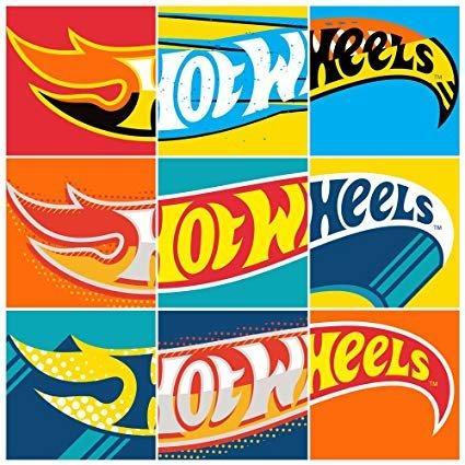
eight 0 Posted January 12, 2009 i have a bad feeling about this... (catch line from starwars...)anyway as for the wheel i got it from this logo below... the best wheels from hot wheels the redlines... Share this post Link to post Share on other sites
Rayz-HWC 0 Posted January 12, 2009 think I Yoda ke!! Share this post Link to post Share on other sites
hokuan 0 Posted January 12, 2009 The logo might sound nicer if put " MY HWC", for Malaysia Hotwheels Club.. Share this post Link to post Share on other sites
sinclair 0 Posted January 12, 2009 I like the T-shirt pic that eight posted, but the words HWC I think need to be made more readable. Share this post Link to post Share on other sites
Rayz-HWC 0 Posted January 12, 2009 Yup...best simple, readable...straight-away recogniseable! ...but somehow will we be copyrighting/trademarking the logos/designs? Think we better Share this post Link to post Share on other sites
dannylee77 0 Posted February 15, 2009 Hi , I notice the winning the Design Was the DESIGN no EIGHT....as on the Banner , Very Nice...... Something just came through my mind .... Just some small , tiny miney opinion.... Wonder if there's a way to put in something like " Established 2009 " " Est. 2009 " " since 2009 " or something like that la on the Logo ...... just my small tiny opinion.... Share this post Link to post Share on other sites